

What Is CRO, Really?
In simple words: CRO means making more of your visitors do what you want them to do — usually, complete a purchase.
It's not about changing the color of your “Buy Now” button and hoping for magic. Real CRO looks at the entire journey a customer takes — from landing on your homepage to clicking “Place Order” — and removes anything that slows them down, confuses them, or makes them doubt their decision.
A Few Myths to Clear Up First
- ✕CRO is not just A/B testing: Testing two versions of a page is one tool inside CRO — not the whole strategy.
- ✕CRO is not only about checkout: Your product pages, search bar, navigation, and even your blog content all affect whether someone buys.
- ✕CRO is not about tricking people: Fake countdown timers or hidden fees might boost sales for a week, but they destroy trust — and trust is what brings customers back.
Step 1: Know Your Current Conversion Rate
You can't improve something you're not measuring. Here's the formula:
Example: If your store got 2,000 visitors last month and 40 of them placed an order, your conversion rate is: (40 ÷ 2,000) × 100 = 2.0%.
What counts as a “good” rate?
It depends on what you sell — comparing a jewelry store to a snack brand doesn't make sense. Rough benchmarks:
| Industry | Typical Conversion Rate |
|---|---|
| Food & beverage | 4.58% |
| Beauty & personal care | 5.32% |
| Pet care & vet services | 5.7% |
| Fashion, accessories & apparel | 2.77% |
| Home & furniture | 1.29% |
| Consumer goods | 1.76% |
| Luxury & jewelry | 0.63% |
If you're above your category's average, you're doing well. If you're below it, that's exactly where fixing things will pay off fastest. shopify.com
Step 2: Decide What to Fix First (The PIE Framework)
Every team has opinions about what should change first. Instead of going with whoever argues the loudest, score each idea from 1–10 on three things:
How much room for improvement is there here?
How much traffic or revenue actually passes through this page?
How quickly and cheaply can you actually build and test this fix?
Average the three scores and tackle the highest-scoring ideas first. A small fix on your checkout page (which every buyer sees) will usually beat a full homepage redesign in terms of results per hour spent.
The Top 10 CRO Techniques for Shopify Stores
1Make Your Product Pages Impossible to Misunderstand
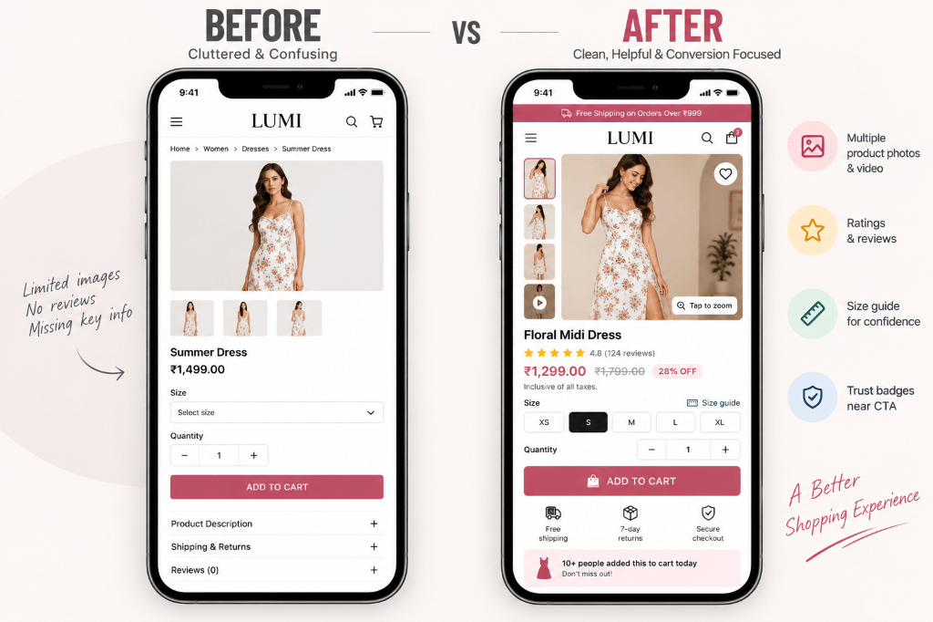
Your product page is where the buying decision actually happens. If a visitor has to guess anything — the size, the price, whether it's good quality — they'll leave instead of asking.
What to fix:
- Photos: Show multiple angles, allow zoom, and mix clean studio shots with real “in-use” lifestyle photos.
- Descriptions: Write about what the product does for the customer, not just its specs. Instead of “100% cotton, 180 GSM,” try “Soft, breathable cotton that feels great even in summer heat.”
- Pricing: Show the original price and discounted price clearly — don't make people do math.
- Trust badges: Put “secure checkout,” “easy 7-day returns,” or “1-year warranty” near the Buy button, not buried in the footer.
- Size charts: If sizing confusion exists, add a clear chart so people don't abandon the page out of doubt.
2Use Shopify Checkout to Remove Every Bit of Friction
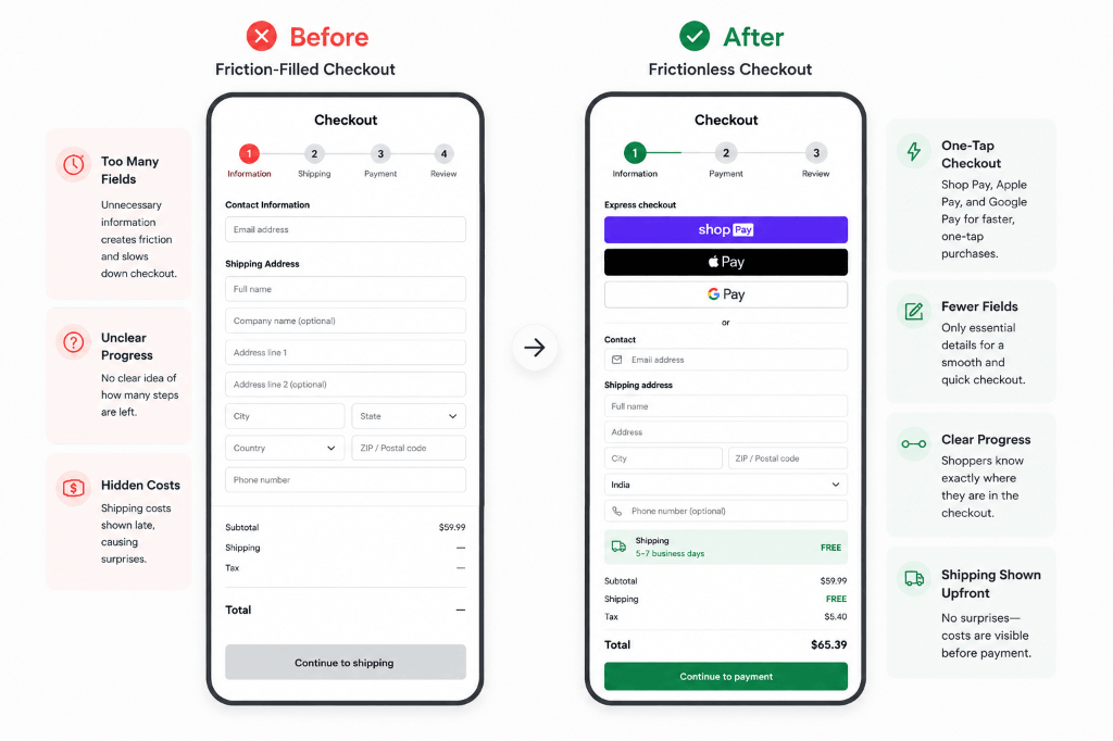
Most cart abandonment happens because checkout feels slow or confusing right at the moment someone was ready to pay — the longer they linger, the more likely they are to have second thoughts.
Shopify Checkout is already built to reduce this friction:
- Custom branding: Match the checkout's look to your store, so it never feels like a redirect.
- Multiple payment methods: Cards, gift cards, local options, and installments in eligible markets.
- One-click checkout: Once a customer has used Shop Pay before, their address and card details are remembered and autofilled automatically — no retyping needed. For Indian D2C brands specifically, apps like WeUpsell provide one-click checkout while layering relevant upsells right at that same fast-checkout moment, while solutions like GoKwik (Kwik COD & Checkout) and Shiprocket Address Prefill offer similar OTP-based fast checkout with address autofill.
- Flexible fulfillment: Delivery, shipping, or pickup, based on what suits the buyer.
- Abandoned checkout tracking: See exactly where people drop off and follow up with recovery emails.
A few extra fixes that help too:
- •Remove unnecessary form fields (does anyone really need “Company Name”?).
- •Show a simple progress indicator like “Step 2 of 3.”
- •Display shipping costs early instead of surprising people at the last step.
3Let Other Customers Do the Convincing (Social Proof)
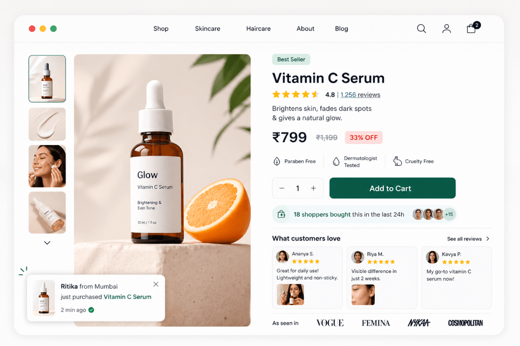
People trust other buyers more than they trust your marketing copy. This matters even more for beauty, skincare, fashion, and wellness products, where shoppers actively look for proof before buying.
What to add:
- Star ratings near the Buy button — not just on a separate reviews tab.
- Photos and videos from real customers (UGC) — these feel far more authentic than studio shots.
- Real-time activity notices, like “12 people bought this in the last 24 hours” — but only if it's true.
- Press or influencer mentions, if you have them.
Example: A skincare brand that added real customer photos next to written reviews saw people scroll longer and add to cart more often — seeing someone else's skin results built more confidence than any product description could.
Apps like Judge.me and Loox make it easy to collect and display unlimited photo and video reviews right on your product page, while Yotpo adds loyalty and referral tools on top of reviews, and Fomo shows real-time purchase notifications like “Someone in Mumbai just bought this” for a gentle sense of urgency alongside the proof.
4Use Popups the Right Way
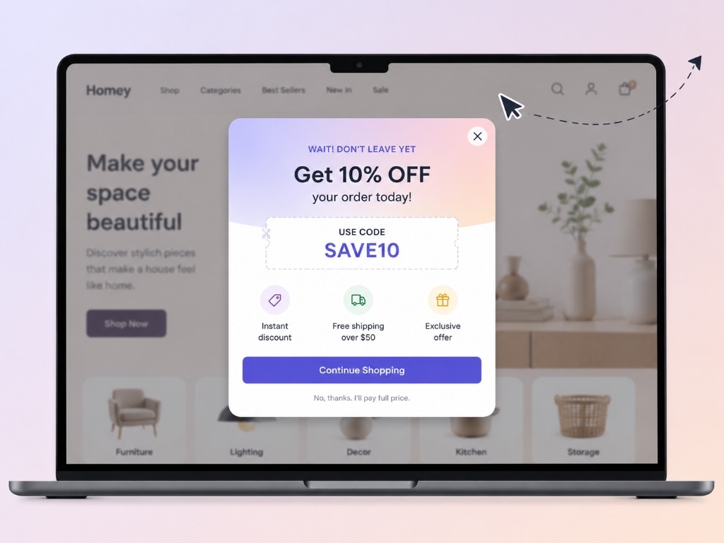
A popup is a small box that appears on top of your page to grab a visitor's attention — usually to highlight a discount code, a giveaway, or something time-sensitive. Used well, popups can turn a browsing visitor into a buyer or at least capture their email so you can follow up later. Used badly, they just feel annoying and push people away.
How to do it right:
- Trigger on behavior: Don't fire it the instant the page loads. Trigger it based on real visitor behavior — for example, after they've scrolled a bit, spent some time on the page, or show signs of leaving — not the moment they arrive.
- Offer something valuable: A discount code, free shipping, or entry into a giveaway — not just “Wait! Don't leave!”
- Make it easy to close on mobile: Include a large, obvious “X” button so it doesn't feel like a trap.
- Use it to build your list: A popup offering a discount in exchange for an email address is one of the simplest ways to build your marketing audience.
Example: Instead of a generic “Don't go!” message, a store offering “Get 10% off if you complete your order in the next 10 minutes” converts far more visitors, because it gives them a real reason to act rather than just guilt-tripping them into staying.
Apps like WeUpsell take it a step further by pairing the popup or cart-drawer offer with a smart upsell — so the discount you show at the right moment also nudges the customer toward a bigger order — while tools like Privy and POWR Popup make it simple to build straightforward offer-based, easy-to-close popups.
5Speed Up Your Site
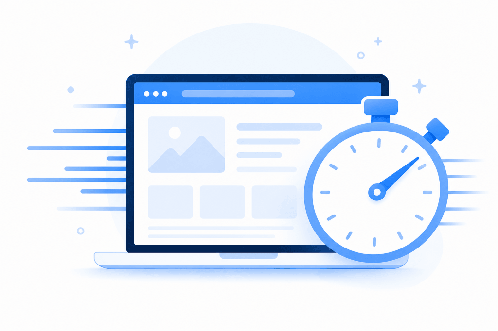
Every extra second your site takes to load quietly chips away at your conversion rate. A slow site feels untrustworthy, even if the products are great.
What to fix:
- Compress images: Use WebP or AVIF formats instead of large PNGs or JPEGs.
- Remove unused apps: Old Shopify apps you're not using can still be loading scripts in the background, slowing everything down.
- Turn on lazy loading: Images and videos below the fold should only load once someone scrolls to them.
6Personalize the Shopping Experience
A store that feels the same to every visitor converts worse than one that adapts based on who's browsing.
What to add:
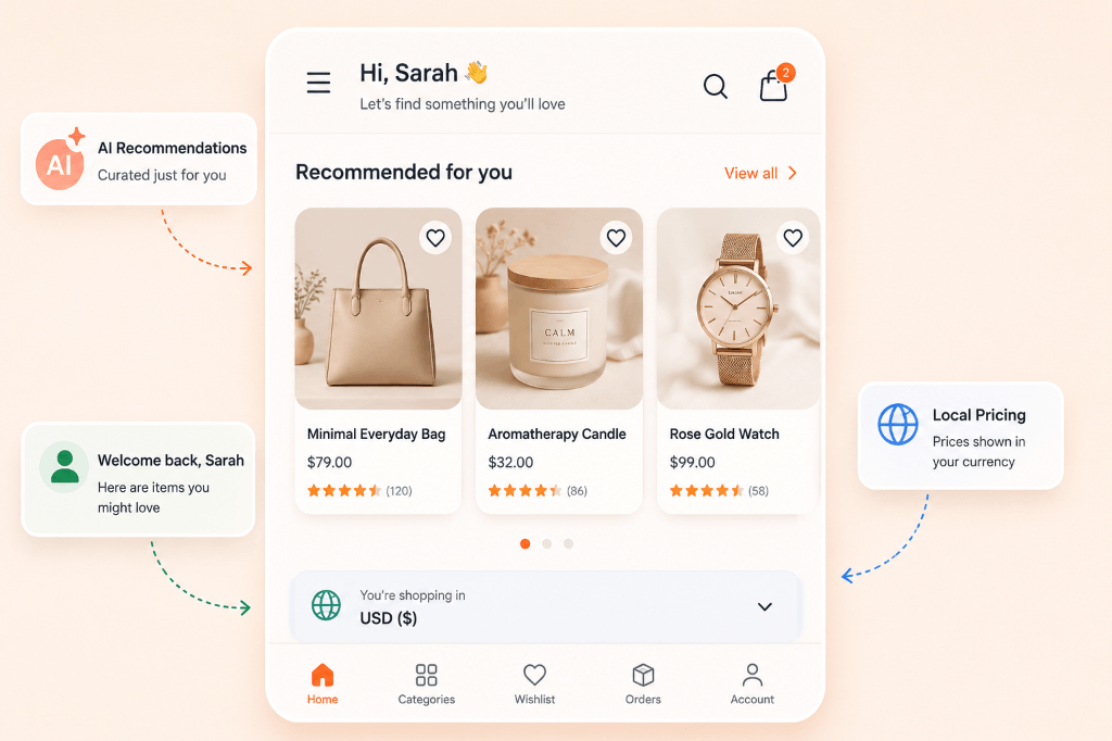
- “Frequently bought together” suggestions on product and cart pages.
- Different content for returning visitors, like showing their recently viewed items.
- Local currency and pricing for international shoppers, so they don't have to convert prices in their head.
Example: A store showing “Customers who bought this also bought...” on the cart page increased average order value, because it suggested relevant add-ons at exactly the right moment.
Apps like WeUpsell and ReConvert Upsell & Cross Sell can show these personalized upsells on the cart, checkout, and thank-you pages automatically, while Klaviyo lets you send personalized emails and SMS based on what a customer browsed or bought, including recently-viewed and abandoned-cart follow-ups.
7Design Mobile-First, Not Just Mobile-Friendly
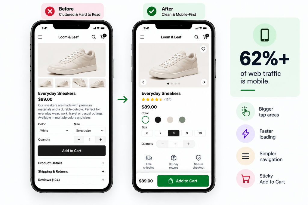
More than 62% of global web traffic now comes from smartphones and tablets, which means a mobile-friendly website isn't a nice-to-have anymore — it's a must. For most Shopify stores, mobile traffic is even higher than that. This means mobile shouldn't be an afterthought — it should be the main design you build for, with the desktop version treated as the secondary layout.
The good news: every Shopify theme is automatically optimized for display on any device, so you're starting from a solid base. But there's still more you can do:
What to fix:
- Bigger buttons: Make sure buttons, filters, and quantity selectors are large enough to tap comfortably with a thumb — no need to zoom in or miss-tap.
- Sticky “Add to Cart” bar: Keep the buy button visible at the bottom of the screen while people scroll through reviews and details.
- Simplify navigation: Try simplifying your site navigation, making buttons larger and easier to press, and reducing the amount of text on each page to avoid overwhelming small screens.
- Check your actual load speed and responsiveness: Use Google's Lighthouse, an automated tool for improving web page quality, and Google's PageSpeed Insights for a detailed page-speed report. Slow, unresponsive pages drive mobile shoppers away faster than almost anything else — and page speed is also one of the factors Google uses when ranking sites.
Example: A brand that added a sticky “Add to Cart” bar on mobile saw more people convert directly from the product page, since they no longer had to scroll all the way back up to buy.
(This section draws on Shopify's own CRO guide, which confirms mobile traffic and page speed are two of the biggest conversion levers today.)
8Use an Announcement Bar (Honest Urgency & Scarcity)
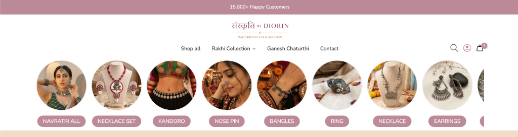
An announcement bar — sometimes also called a “hello bar” or “welcome bar” — is that thin strip that sits at the very top of a website. Unlike a popup, it doesn't cover the page and can't be dismissed, so it's a fast, non-intrusive way to tell every visitor something important the moment they land on your site: a sale, a free-shipping threshold, a new launch, or a genuine deadline.
Urgency can genuinely push people to act — but only if it's real. Fake countdown timers that reset when you refresh the page destroy trust fast, and savvy shoppers notice.
What to put in it (only when true):
- Real stock levels: “Only 3 left in stock” — when that's actually accurate.
- Real order deadlines: “Order in the next 2 hours for same-day dispatch.”
- Real sale end dates: A discount that actually ends when it says it will.
- Free shipping thresholds: “Free shipping on orders over ₹999” is one of the most effective, always-honest things to put in an announcement bar.
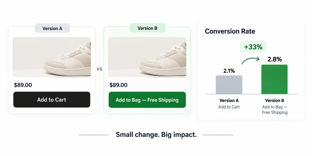
9Simplify Your CTA Buttons and Test Continuously (A/B Testing)
Your call-to-action (CTA) is the button or link that tells a visitor exactly what to do next — “Add to Cart,” “Buy Now,” “Get Yours Now.” It takes a visitor only a fraction of a second to form a first impression of your page, so your CTA needs to be simple, obvious, and placed where people will actually see it — ideally without needing to scroll.
But you shouldn't just guess at what works best. CRO is an ongoing, iterative habit: you form a hypothesis, test it against the original with real traffic, and let the data — not opinions — decide the winner. This is called A/B testing.
What to test:
- Button text: “Add to Bag” vs. “Get Yours Now” — small wording changes can shift click rates.
- Button placement: Above the fold vs. further down the page.
- Pricing display: Bundle discounts vs. showing savings per unit.
- Give it enough time: Don't declare a “winner” after just a day or two — wait until you have enough orders for the result to be statistically meaningful, not just random luck.
10Make Products Easy to Find
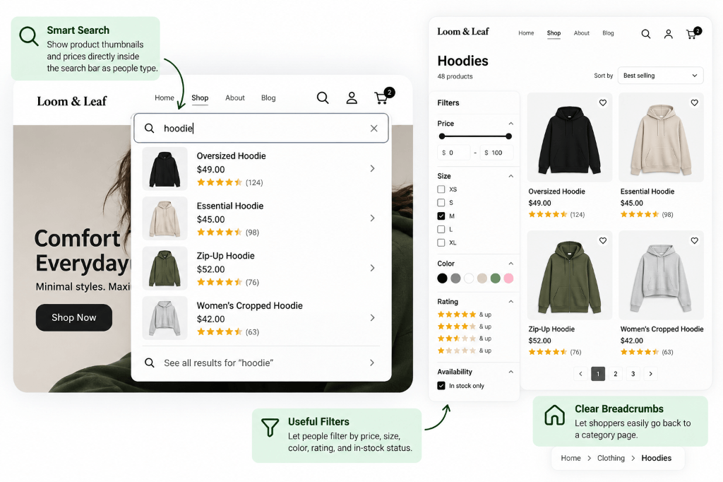
If a visitor can't quickly find what they're looking for, they'll leave — even if you have exactly what they want somewhere on your site.
What to fix:
- Smart search: Show product thumbnails and prices directly inside the search bar as people type.
- Useful filters: Let people filter by price, size, color, rating, and in-stock status.
- Clear breadcrumbs: Let shoppers easily go back to a category page without hitting the browser's back button.
A Quick Note on CRO Tools
You don't need a huge budget to start. Pick one solid tool per category instead of overloading your store with competing apps:
CRO and SEO Work Together
It's easy to think of “getting traffic” (SEO) and “converting traffic” (CRO) as separate jobs. They're actually connected:
A faster site ranks better on Google and keeps shoppers from leaving out of impatience.
Google ranks mobile-friendly sites higher, and a smooth mobile checkout means more of that traffic actually converts.
A product page that clearly answers buyer questions satisfies search engines and shoppers at the same time.
Final Thoughts
CRO isn't about one big, risky redesign. It's about steadily removing friction and building genuine trust at every step of the customer's journey — one small, tested improvement at a time.
Quick Recap: The 10 Techniques
- 1. Make product pages crystal clear
- 2. Use Shopify Checkout to remove friction (one-click, autofill)
- 3. Let social proof do the convincing
- 4. Use popups the right way
- 5. Speed up your site
- 6. Personalize the shopping experience
- 7. Design mobile-first, not mobile-friendly
- 8. Use an honest announcement bar
- 9. Simplify your CTAs and test continuously
- 10. Make discovery and navigation seamless
10 Shopify Marketing Apps to Grow Your Store in 2026
Pair your CRO techniques with the right app stack. Compare 10 verified Shopify marketing apps grouped by traffic, conversion, and customer retention.